
Mobile Web Design · UX/UI · Brand Experiences
Role: UI/UX Designer, Graphic Designer
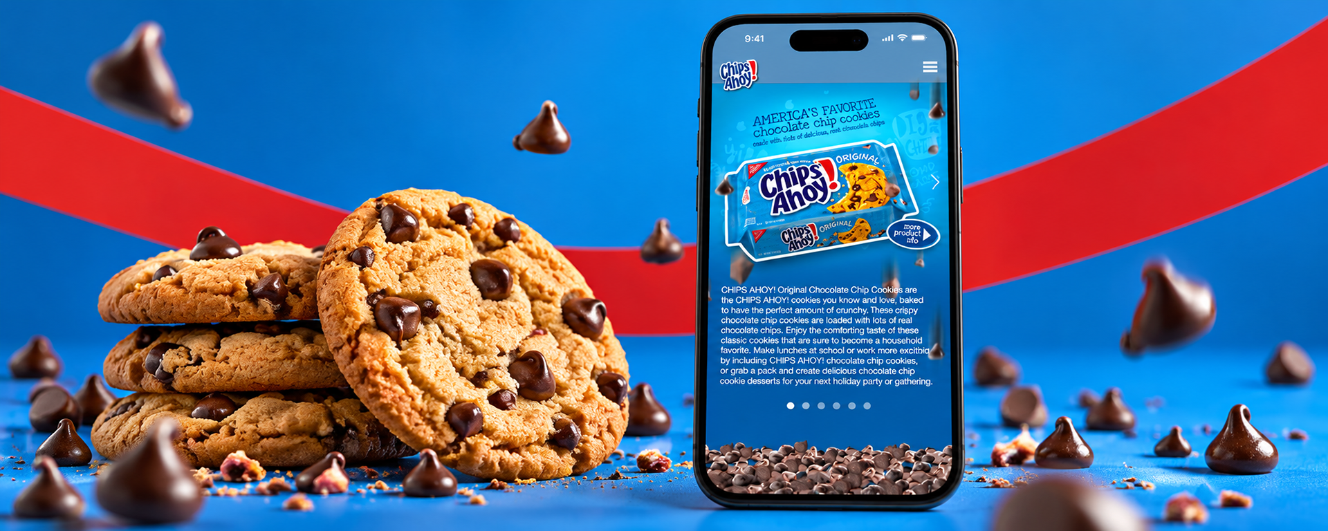
Designing the Chips Ahoy! mobile site was an opportunity to bring the brand’s playful personality into product browsing, recipes, and social content. I wanted the experience to feel energetic and snackable, with enough structure to make the practical information easy to find.
The product range gave me room to vary color and imagery while keeping the overall design consistent. Chocolate chips animated as visitors swiped between sections, turning a familiar product showcase into something more expressive.
CHALLENGES
The site had to give different cookie varieties their own presence while keeping navigation and information consistent. Playful motion, product descriptions, social posts, and detailed recipes all needed to work within the limits of a mobile screen.
GOALS
Show the range clearly: Give each product a distinct visual treatment with direct access to supporting information.
Connect fans with content: Bring social posts and sharing prompts together in an approachable mobile hub.
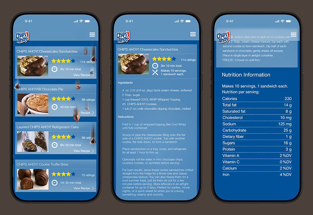
Make recipes usable: Organize ingredients, preparation steps, and nutrition details into clear views.
ACCOMPLISHMENTS
Built a flexible visual system: Carried the brand’s color, typography, packaging, and cookie imagery across product and content pages.
Added purposeful playfulness: Used tumbling chocolate chips to connect product sections and reinforce the brand’s character.
Balanced fun with function: Combined expressive product storytelling with clear navigation, recipe structure, and product details.
PRODUCT VARIETY & PLAYFUL MOTION
I gave Original, Chewy, and Chunky their own color and product-led composition while keeping the controls in familiar positions. Tumbling chocolate chips connected the sections, and a prominent product-information link provided a clear route to the practical details.

SOCIAL CONTENT & NAVIGATION
The social hub brought fan content together with a direct invitation to join the conversation. I used a consistent card structure to organize posts and imagery, while the slide-out menu made the product range accessible without crowding the feed.

RECIPES & PRACTICAL DETAILS
Recipe cards put the finished treat, ratings, and preparation time up front. The detail views then separated ingredients, instructions, and nutrition information, helping visitors move from inspiration to the steps they needed to make the recipe.
Interested in working together?